1. Make sure your flyer is consistent with your business brand and the rest of your business stationery.
2. Use contrasting colours that stand out, are easy on the eye but do not clash!
3. Choose a font that is easy to read at first glance and is large enough for the reader to see clearly. Use a maximum of two fonts on your flyer design, using more conventional fonts for the main bulk of text.
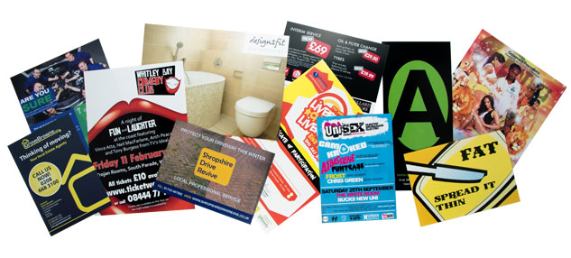
4. Don’t clutter! Remember why you are producing the flyer and try to convey the main points to the reader. One carefully selected image or photograph can be enough to quickly show what you are offering at a glance. Too many words or images will distract from the overall purpose of the flyer.
For example; if the purpose of the flyer is to launch a promotion then the main focus should be: what is being promoted, how much, how long for and when/where can it be obtained? If you are offering a service, such as Window Cleaning, then ideally you will want a striking image to reflect this at a glance.
5. Use colours, shading, bold, bullet points and boxes or graphics to highlight important parts of your flyer design that you would like to stand out.
6. If you are trying to include a lot of information you may want to have your flyer printed double sided to maximise its use.
7. Proof read your flyer and ideally get somebody else’s opinion before your flyer goes to print. Check and double check that important details such as dates, telephone numbers, email and web addresses and all other contact details are correct. There is nothing worse than spelling and grammar errors on a finished flyer and you would be surprised how often we re-print jobs because content has not been proof read by the customer.
8. Have your flyer professionally designed. This may sound obvious but a poorly designed flyer can really give the wrong impression of your brand and in the long term will cost you time and money to fix. For example; designing a flyer in Microsoft Word using clip art is probably not the best idea. Before choosing a designer ensure that you look at their portfolio, this will give you an idea of his/her capabilities and as a result will ensure you receive a professional looking end product.
9. If your flyer is going to be written on by the recipient then it is essential to choose an uncoated or silk stock. Gloss stock can be difficult to write on without the use of permanent pens.
10. Choose the right size and thickness of your flyer to suit your audience.
For example; if you are handing out flyers on a busy high street then you are likely to need something small and lightweight that will easily fit into someone’s hand, handbag or pocket, so an A6 flyer might be the preferred size in this instance, or possibly A5 but printed on a thinner stock such as 150gsm that would be easy to fold in half.
If your flyer is going to be delivered through letterboxes then a heavier stock such as 300gsm would be more suitable as it is easier to post through doors.
We offer a cost effective professional design service for all of our printed products and offer competitive prices on both flyer and leaflet printing.